


Accessibility regulations
Accessibility is not an option for public sector organisations. They have to follow a law called:
“The Public Bodies (Website and Mobile Applications) Accessibility Regulations”. It was published in September 2018. It outlines what public sector organisations need to do to make their digital services accessible.
The law is based on the Web Content Accessibility Guidelines (WCAG). These are guidelines created by the World Wide Web Consortium (W3C). There are 3 levels of compliance with WCAG:
- level A (lowest)
- level AA (mid range)
- level AAA (highest)
Public sector digital services need to be at least a level AA. This is the legal minimum. HeX Productions have worked with public sector organisations for many years. We found some of the most common issues on their websites are easy to fix.
Poor heading structure
Using a heading structure helps organise information. It breaks content into smaller chunks to make it easier to understand.
Common issues are:
- the heading levels are not used in the right order
- some heading levels have been skipped
This often happens if people only use headings to make a page look a certain way. Like the font size or text colour. But they’re essential for understanding the page structure.
Fixing these issues makes pages more accessible. For example, they help people:
- who use screen readers
- with cognitive difficulties
- with learning difficulties
How to use a heading structure
There should be one Heading 1 (H1) on your page. This is your page title and only 1 of these.
A Heading 2 (H2) is used for a major section heading. A Heading 3 (H3) is a subheading of a Heading 2. You can have more than one H2 and H3 on your page. But you must follow the structure of heading (H2) and subheading (H3). Learn more about heading structure and accessibility.
You can use your content management system (CMS) to check and edit most of your heading structures.
Some website templates use the heading style not the heading level to decide the page layout. For example, homepages. This can create confusion as the heading levels don’t follow a logical order. These headings are often built into the code of the website. You’ll need a developer to fix these so they are in the correct order.
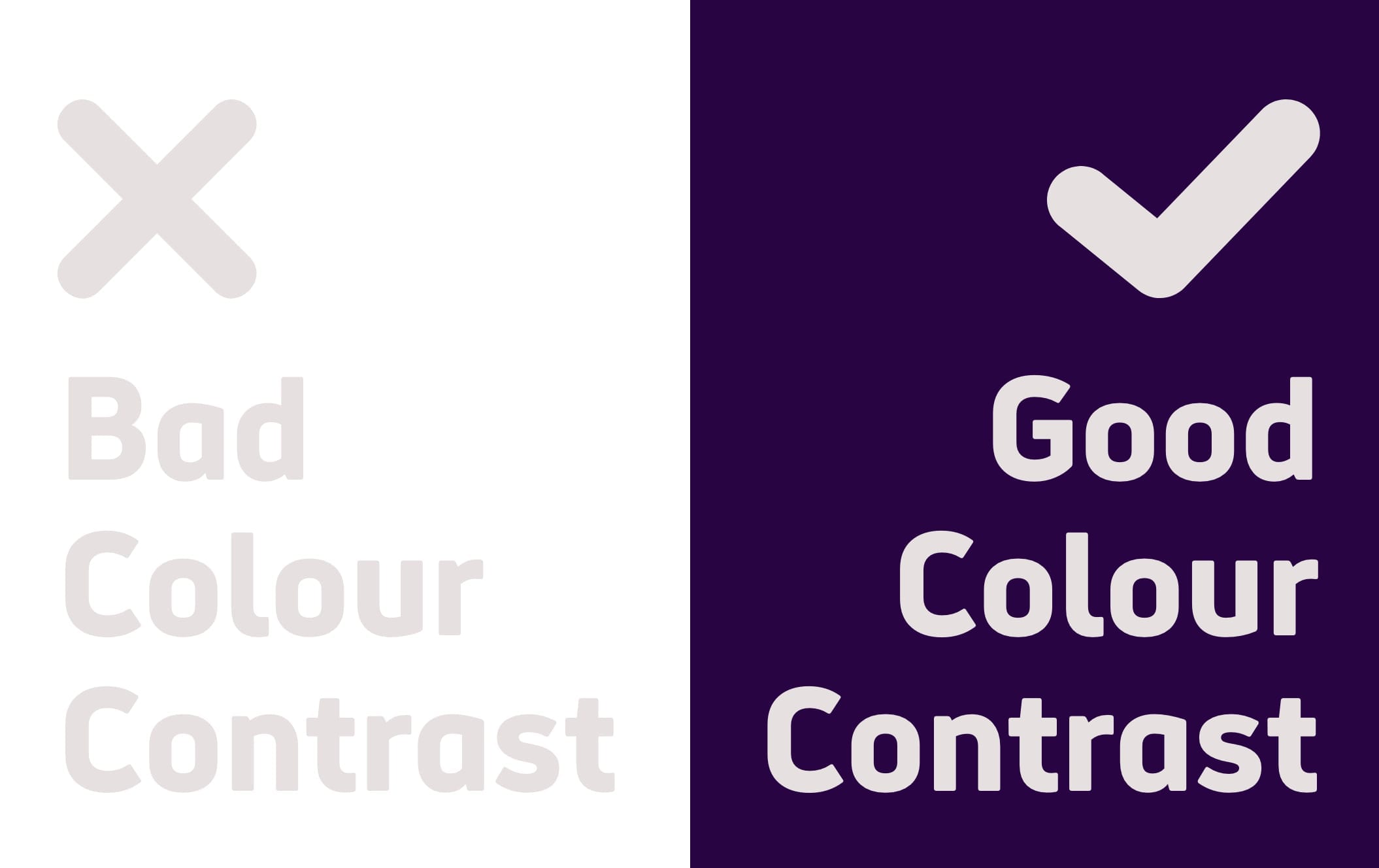
Low colour contrast
WCAG guidelines say there must be a contrast ratio of at least:
- 5:1 for normal text which is under 18pt or 14pt bold.
- 3:1 for large text, graphics and things like buttons. Large text is above 18pt or 14pt bold.
Below is an example of good and bad colour contrast.
Using a high contrast ratio makes websites more accessible for people:
- with low vision
- who are colourblind
- who have low contrast sensitivity, this is common in older people
- who have dyslexia
How to fix low colour contrast
There are tools available online to help you check for colour contrast. One option is WebAIM’s Colour Contrast Checker.
You might only need to make small changes to meet the guidelines. If you find that there are a lot of issues on your website, you might need to think more about your use of colours.
No keyboard access
There are people who use a keyboard instead of a mouse to navigate a website. This is often called “tabbing”. By default, many browsers show an outline around the part of the website the user is on. You will see a great example of this if you visit GOV.UK and start going through the website by pressing the “tab” key. There is an obvious yellow highlight showing you where you are on the page. This is a focus outline or focus border.
On some websites, this is not available. Adding “outline:0 or outline:none” into the code removes the focus outline. The creates a big accessibility barrier.
Focus outline is an for people who need to use tabbing to visit a website. For example:
- people with motor impairments who cannot use a mouse
- visually impaired users who cannot see the mouse on a page
- anyone who prefers to use a keyboard or cannot use a mouse
How to fix keyboard access
You can check your website’s accessibility by trying to navigate it using the keyboard. If there is no focus outline, a developer will need to remove the code “outline:0 or outline:none”. They can also add a blue or a yellow highlight to make the focus outline even clearer. Make sure the colour you use has enough contrast with the content on page.
Automated testing and user testing for accessibility
Missing alternative text for images
You should describe all your images, this is called alt-text. Alt-text describes what’s in your image. If an image is only for decoration, you can mark it as decorative. This will tell assistive technology to ignore the image.
It is very common for images on websites to have no alt-text. When there is alt-text, it is sometimes poor and does not give the information needed.
Alt-text can be helpful for many people, including people:
- who use screen readers and assistive technology
- with a slow internet connection who cannot load images
How to add alternative text for images
Most content management systems have an option to add alt-text or to mark an image as decorative. You can go over your pages and check if there is alt-text.
The most difficult part is creating alt-text that is meaningful. The following tips might help you:
- Do not start your alt-text with “picture of…” or “image of…” as screen readers will give this information.
- Start your sentence with your description.
- Think about what you are trying to tell people with your image. Make sure your alt-text describes this, not what is literally in the image.
- Keep your alt-text short. Try to avoid more than 2 sentences.
- If your image has no meaning, mark it as decorative.
Empty form labels
It is very common to find forms on websites. In the public sector, forms are often essential. They might be used to:
- change your address
- contact your Local Authority
- report a problem
Form labels should describe what they are asking the visitor to do. Without them, screen readers cannot tell what information the user needs to enter.
How to add form labels
A developer will be able to help you with form labels.
If the form label is visible on the page, they should make sure it has the <label> element. This element will help associate a text label with a field on the form.
If the form label is not visible on the page, it can be labelled using ARIA code. They help identify features to screen readers.
Introduction to ARIA tools (Google Developers)
Meaningless link text
The text of a link should help people understand where this link is going. It’s an accessibility issue when links say “Click here” or “Read more”. It does not tell people what website or content they’re clicking onto.
Using meaningful link texts helps every user. But it is especially important for people who use:
- screen readers can make a list of links to go through them.
- speech recognition software can select a link by saying “Click [Link name]”.
If the links on a page all say “Click here” or “Read more”, it will be impossible to use these functions.
How to write meaningful links
You can edit hyperlinks by going into your content management system. Think about where the link is going and write more descriptive text. For example, ‘how to write meaningful link text’ not ‘link text’.
If your link is a button, the code will need to be changed. In the public sector, there are often ambiguous buttons. If a button says “Pay”, what is the user paying for? You could change this to “Pay your council tax” for example. If a button says “Report”, what is the user reporting? You could change this to “Report a missed bin collection” for example.
If the button makes sense visually, you can use ARIA to add context for screen readers. This means the button will still say “Pay” but people who a screen reader would read “Pay your council tax”.
ARIA-label attribute guide (Moz)
How to write a legally compliant accessibility statement
These 6 common accessibility errors are not the only things you need to look at. Legally, public sectors must have an accessibility statement on their website. This statement must:
- show the date of the most recent audit
- list all the errors that have not been fixed
- write about how they plan to fix issues
- tell people how they can get accessible versions of the content
- tell people how to complain if they are not happy about the accessibility of the website
Finding out the issues is only a start. The next step is to plan how you are going to fix them to make your service more inclusive.
