


Making your images accessible
What you will learn in this chapter
- Resources on the different types of images
- Guidance on writing alt-text
- Other barriers with images
Introduction
Images are something many organisations struggle with. They may add alt-text but provide too much detail. Or they do not give enough detail, like not describing the slogan written on a t-shirt they’re trying to sell. You also need to think about other aspects of accessibility when using images.
- Is there enough colour contrast between elements? This includes text, graphics, icons.
- Can you still read text when it’s overlaid on a textured background, like in a photograph? Does the background interfere with the text?
- Do you have too many images on your page?
Alt-text and understanding the different types of images
These tutorials explain the different types of images there are. They also offer examples of how you might write alt-text for each image type.
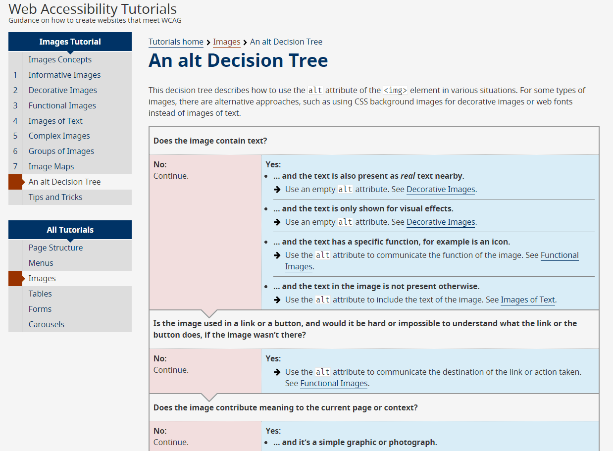
If you’re not sure what type of image you are using and you’re not sure what alt-text to give it, this decision tree can help. It asks you questions and guides you to the type of image. It then links to the tutorials on how to write alt-text for that image.
We also have a couple of Scope for business resources that cover what good and bad alt-text might look like. There are also other tips, like not starting with ‘image of’ at the start of each description.
- How to write better alt-text descriptions for accessibility (Scope for business)
- Avoid these common alt-text mistakes (Scope for business)
Other things to consider for image accessibility
Image accessibility is not just about alt-text. For example:
- using icons to help with navigation for those who struggle with text
- explaining complex content or data can be more accessible as an image, Just make sure a text version is also available.
- image size and text pixelation, can your text still be read when zoomed in at 200 per cent?
WebAIM have included some things to consider when using images.