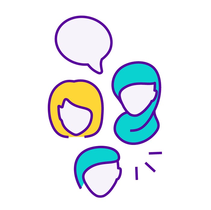
We live in a diverse society with lots of cultural differences. But there are also differences in how we interact and experience the world.
Accessible design
Accessible design means you’re thinking about everybody. You consider the different ways people perceive and interact with your content. This includes people with different impairments and conditions. For example, people who:
- struggle with bright colours
- find it difficult to click buttons or links
- need good colour contract
- experience pain or vertigo if images are moving
- use images and text to learn and understand content
Accessibility is not just about people being able to use your content. It’s also about making people feel represented and included in your content. Accessibility in design can help you have a bigger impact on your audience. It’s also an opportunity to be creative and innovative.
How we developed Scope’s visual identity
Before we started developing Scope’s visual identity, we met with a focus group. We included disabled people with different impairments. During the session, we:
- tried different illustration styles
- tested them with the group
- asked the group questions about different graphic design styles
The session helped give us a creative direction. It also gave us information about how audiences perceive illustrations and icons differently. We learnt two important facts:
- use common symbols that can be easily recognised rather than unusual icons
- icons and illustrations need to have a consistent meaning wherever they are used

Scope’s visual identity
We created a new illustration style unique to Scope. It’s full of meaning and personality. After learning from the focus group, we wanted our new style to be:
- creative
- clear
- inclusive
- diverse
We started with illustrations of people. We have diverse characters. Some have visible impairments, and some have less visible impairments. They also have different:
- body shapes
- ages
- fashion styles
- hair styles
We wanted to include these personal elements to make our style more human and easier to identify.
We also created illustrations about different parts of life, for example:
- employment
- education
- fundraising
These illustrations helped shape our brand identity. They help us engage with our audiences on a more personal level.
