


Colour accessibility and contrast
What you will learn in this chapter
- Colour contrast ratios
- Tools to check colour contrast
- Colour blindness simulators
Introduction
Not having enough colour contrast is a common accessibility issue. This is where 2 colours are too similar or are difficult to tell apart. This is particularly difficult for people with low vision or who are colour blind.
Many organisations fail the Web Content Accessibility Guidelines (WCAG) colour contrast criteria. So it’s really important to check you have enough contrast when:
- creating websites, PowerPoint presentations, posters, leaflets and so on
- putting text on an image, graphic, button or coloured background
- changing the colour of your text against a white page, like changing text to red in an email.
Bright red text is inaccessible against a white background. It has a contrast ratio of 3.99:1. To comply with the WCAG AA standard, you need to have at least:
- 4.5:1 for normal text
- 3:1 for large text and graphical objects
Don’t worry, there are tools to calculate the contrast ratio. You’re not expected to work it out yourself! We’ve included some examples in this section.
You should also not just use colour to convey information. For example,
- red and green buttons to convey start and stop
- a key for a graph
- highlighting text in a document
You must add labelling, patterns or alternative formats of the information. Like a summary for a graph. If you’ve used colour to signify a link, you should also use underline for anyone who cannot see the colour. You might use bold for text you’ve highlighted with colour.
This makes the content accessible for people with a range of impairments. Particularly those who are colour blind.
It’s also worth noting that some users will change the colours on a website or change the background. Like using dark mode or hight contrast modes. It’s important to make sure your content is still visible and usable when modified.
How users change colours on websites (GOV blog)
Here are a few tools to help you with checking your colour accessibility.
WebAIM contrast checker
This is an easy tool to use. All you need to do is copy and paste the hex code of the 2 colours you want to use into the foreground and background boxes. It will then tell you the contrast ratio. It says if it passes or fails the WCAG contrast criteria for AA and AAA standards.
It also gives you a demo of what those 2 colours look like together.
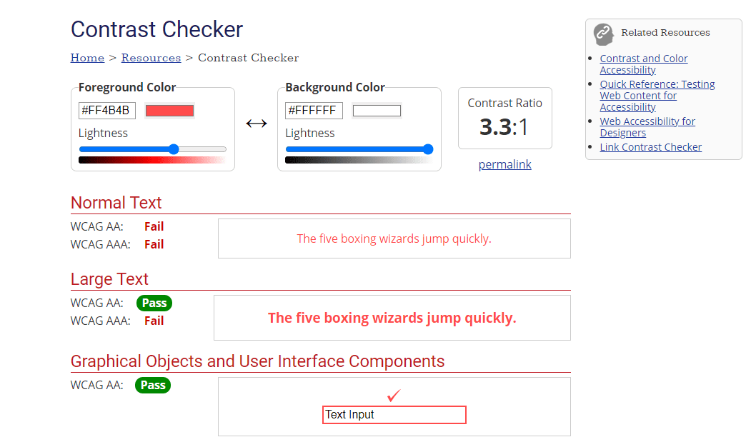
If you’re using your organisation’s colours, the design or brand guides usually have hex codes.
If you’re using other colours, say in an email, you can get the hex code easily. Click the text colour icon and then ‘more colours’. Click the ‘custom’ tab. The hex code is at the bottom.
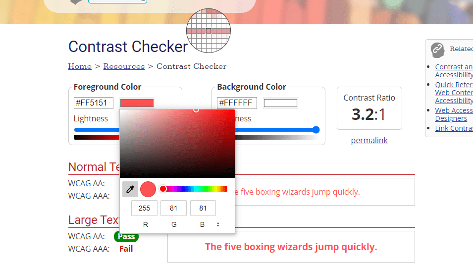
Alternatively, you can click the colour box next to the hex code in the contrast checker. This lets you do one of the following:
- choose a colour using the scale
- add the RGB numbers
- use the colour picker
Accessible colour palette builder
If you have a few colours you need to check for colour contrast, try this tool.
The accessible colour palette builder tells you which colour combinations you can and cannot use. This means you check more than 2 colours at once. It’s particularly helpful for checking brand colours.
For example, the tool shows that Scope’s dark purple and teal is an accessible combination. But Scope’s off-white and teal cannot be used together.
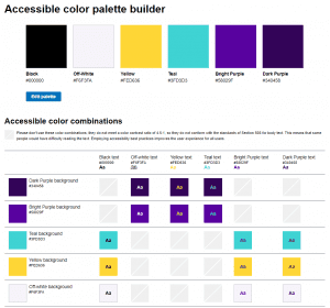
Please note, this tool only checks contrast 4.5:1 for normal text. It does not check contrast of 3:1 for large text and graphical objects.
Accessible colour palette builder
WCAG colour contrast checker extension
This browser extension checks the colour contrast of elements on an existing webpage. It lists all the colours, their contrast ratio, and if they are compliant.
Look out for the ‘eye’ icon as this tells you if the colour is visible on the page. If it just has an eye with a line through it, you can ignore it as that colour is not visible to the user.
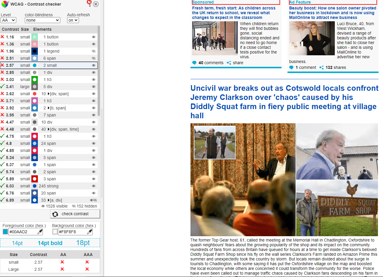
This tool is helpful for brand colours. Often, colour contrast in a logo or design asset is compliant because the text is large.
When you use that same colour for text on the page, the colour contrast might not be accessible for that text size. For example, page content or link text. Orange is a good example of this. So make sure when you use brand colours in different contexts, there’s still enough contrast.
The tool can also change the page to show you how it looks for someone with different types of colour blindness. This helps you check if you can still understand important information when you’re not able to tell colours apart. Like on a graph.
WCAG colour contrast checker chrome extension
High contrast browser extension
This can help you test what your website looks like to users who need high contrast to access your content.
High contrast Chrome browser extension
Colour blindness simulators
There are a couple of colour blindness simulators. You can use these to check colour combinations when creating documents and assets. Particularly graphs and charts.